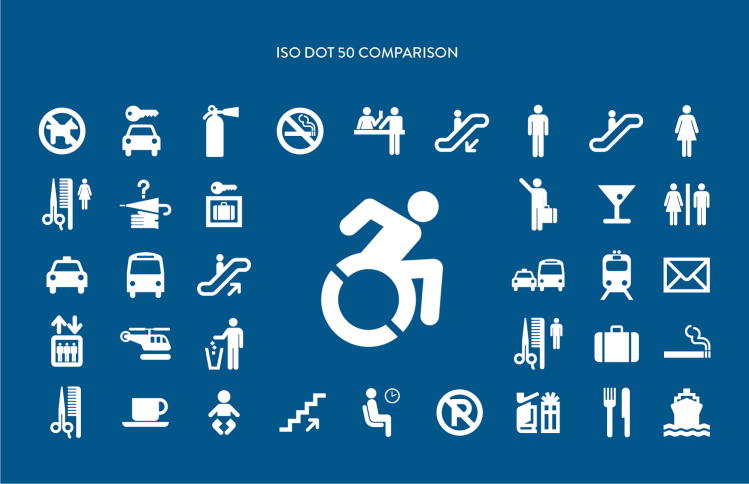
We all know someone or have a loved one with a disability. Below is a great article from AIGA on design, and how to convey accessibility to buildings, transportation, and also about, user-centered museum information graphics. The isotype icons (below) are evolving, along with amazing Apps like BlindWays, providing clues to accessibility where gps fails, and AccessNow, rating the status of restaurants and concert venues etc.
This article has inspired me to think beyond my own small world. I’ll be looking around more to notice how these symbols are used in my city, at events, and utilized in public spaces I’ll be visiting this year. On the lighter side, so maybe, the martini glass should be a beer stein, and the boat should have a side view.
Please share. Your thoughts are welcomed!
~Tresa


Very interesting! I shall look for them too!
LikeLiked by 1 person